Solaire Candle Company
Branding and Packaging Design
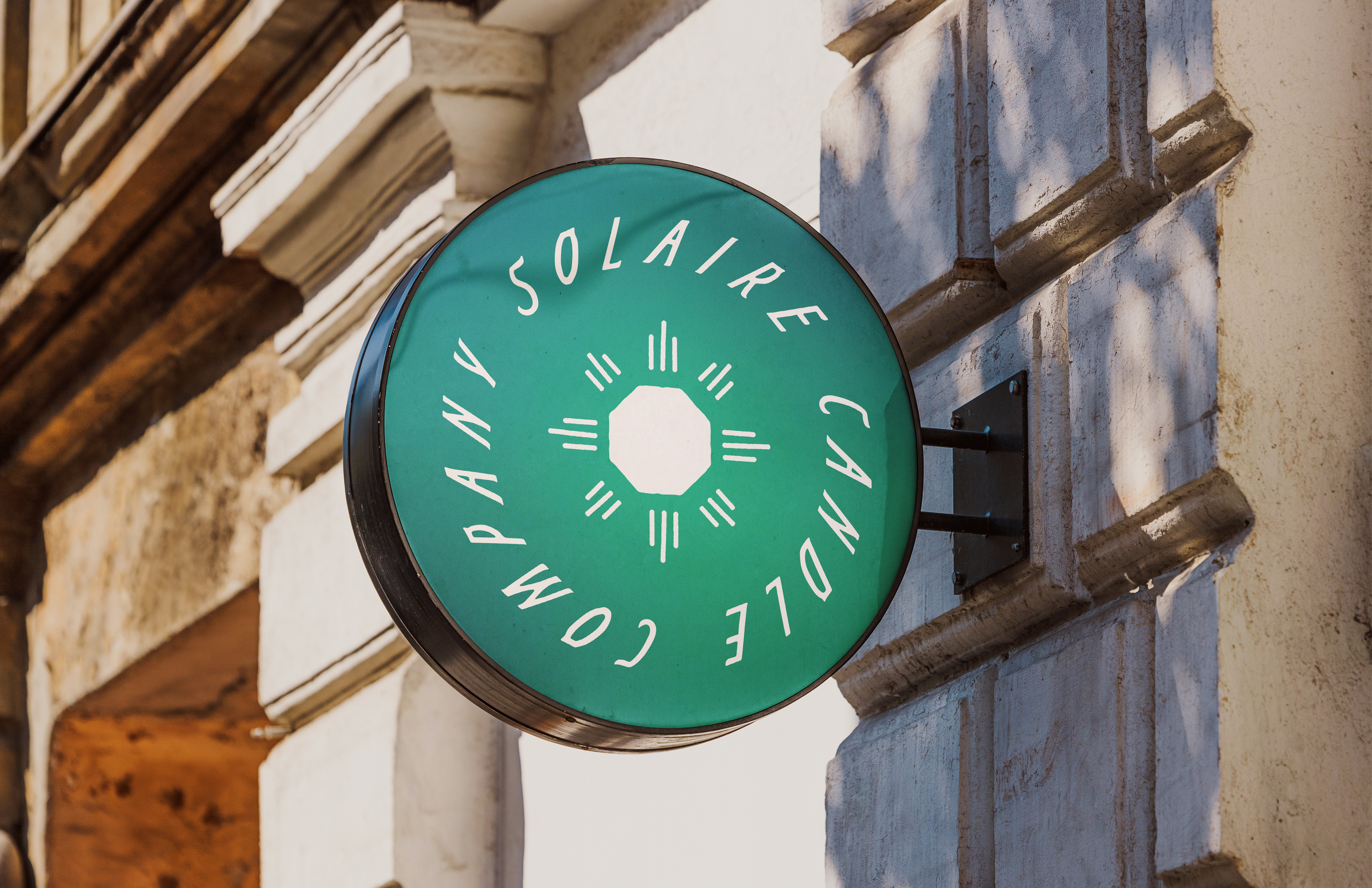
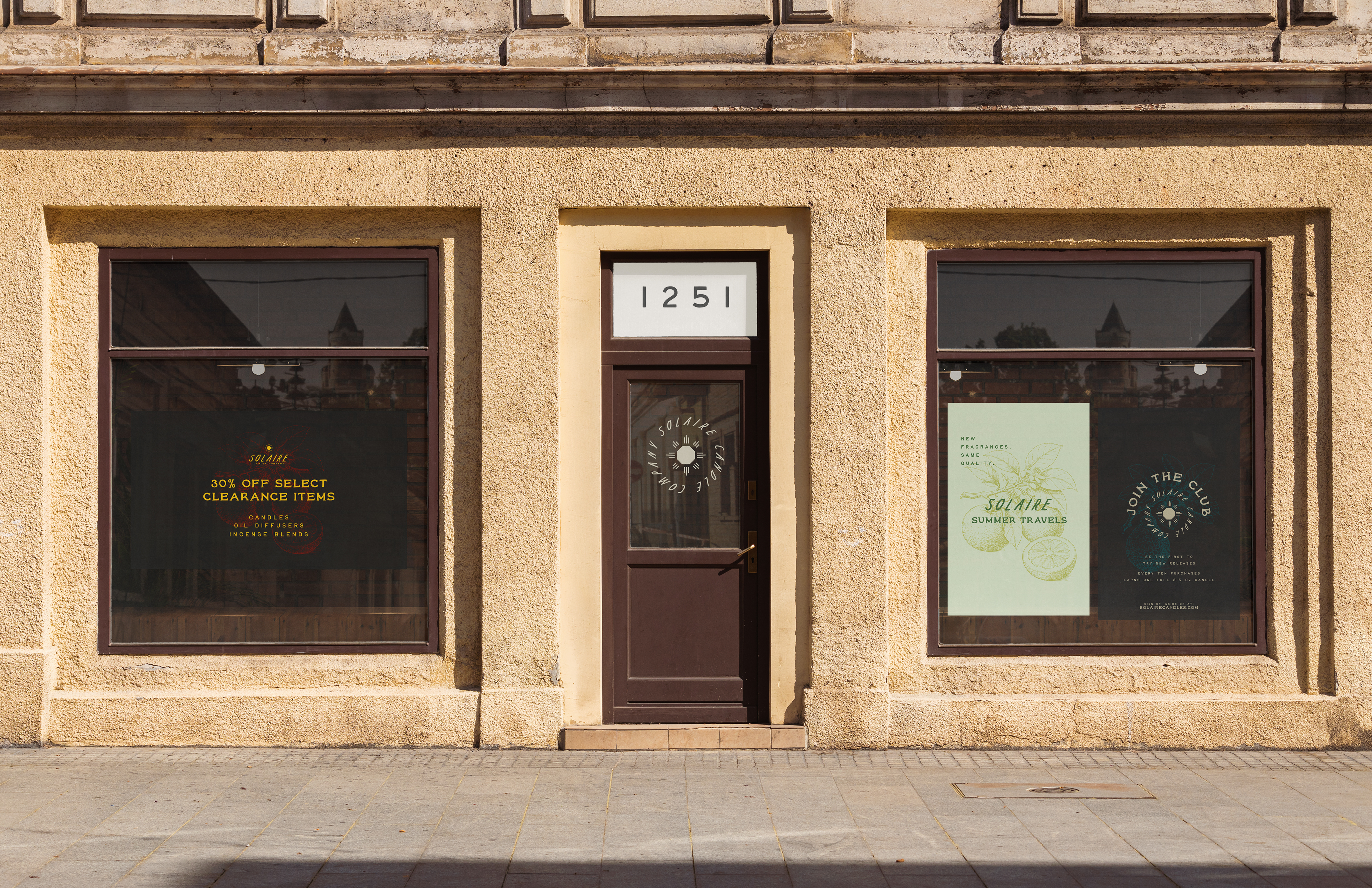
Solaire Candle Company is a travel-inspired fragrance brand built around the idea of scent as memory. The packaging system pairs a deep charcoal ground with hand-drawn botanical illustrations rendered in muted green, yellow, and blush — each scent given its own illustrative identity while remaining part of the same world. Vintage typography and the brand's recurring sun motif anchor the identity across both jar labels and outer boxes, creating a cohesive shelf presence that feels collected rather than manufactured.
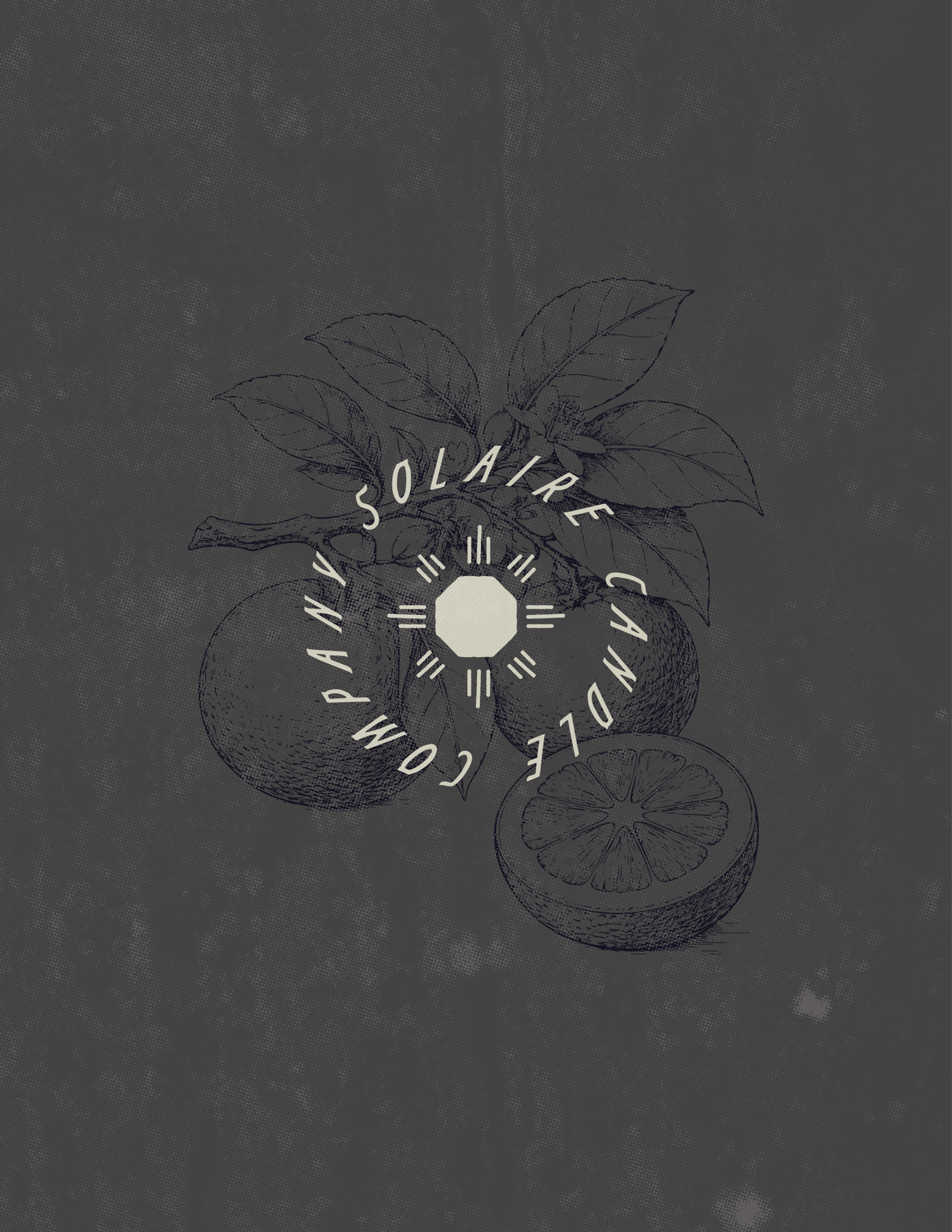
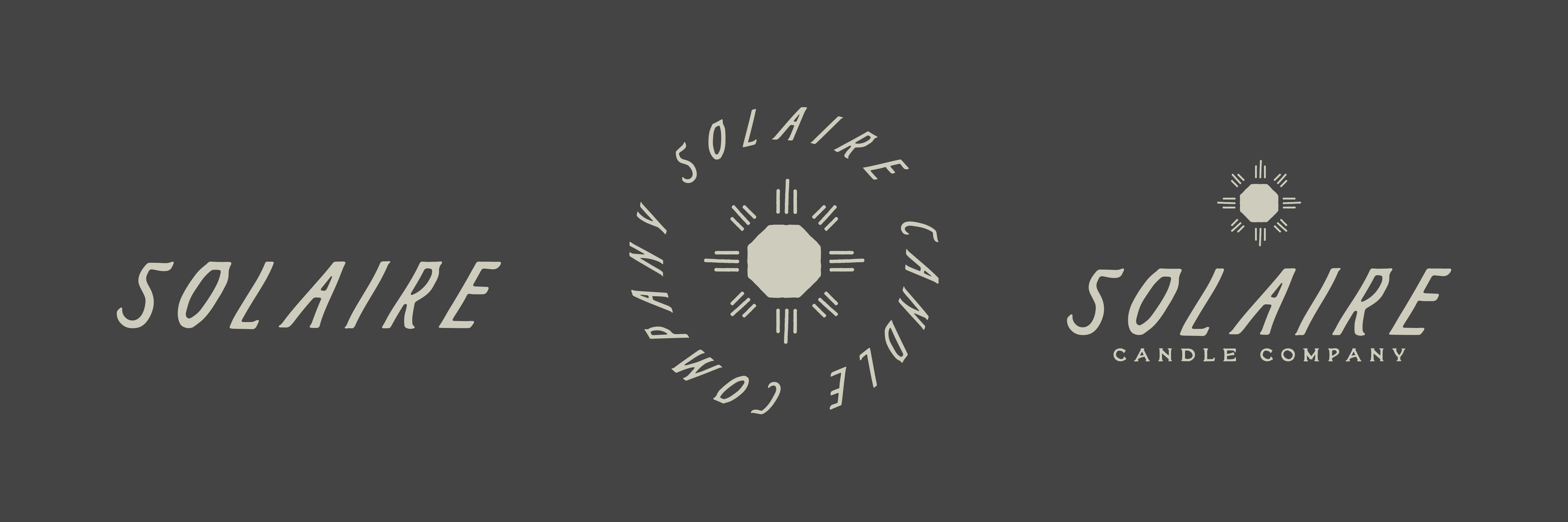
Logoset designed for all use cases for the Solaire Candle Company brand. Designed to invoke a sense of simplicity; inspired by desert modernism and the graphic traditions of the Southwest.
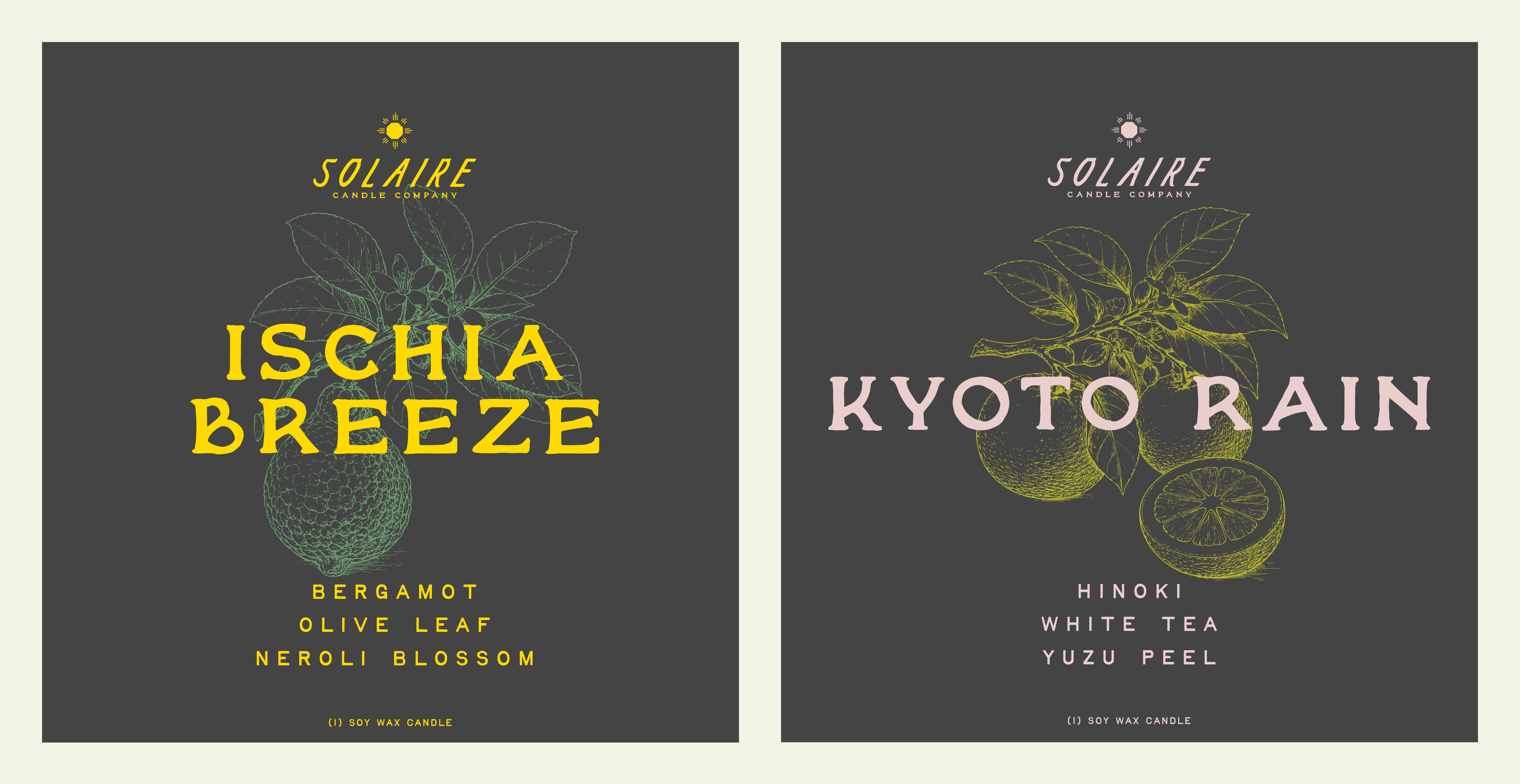
Packaging designed to stand out on shelves and encompass the emotion delivered by the Solaire brand. Focusing on destination-inspired scent names to promote the idea of scent as memory. Utilizing botanical illustrations to promote a premium brand without losing the soul of the brand.
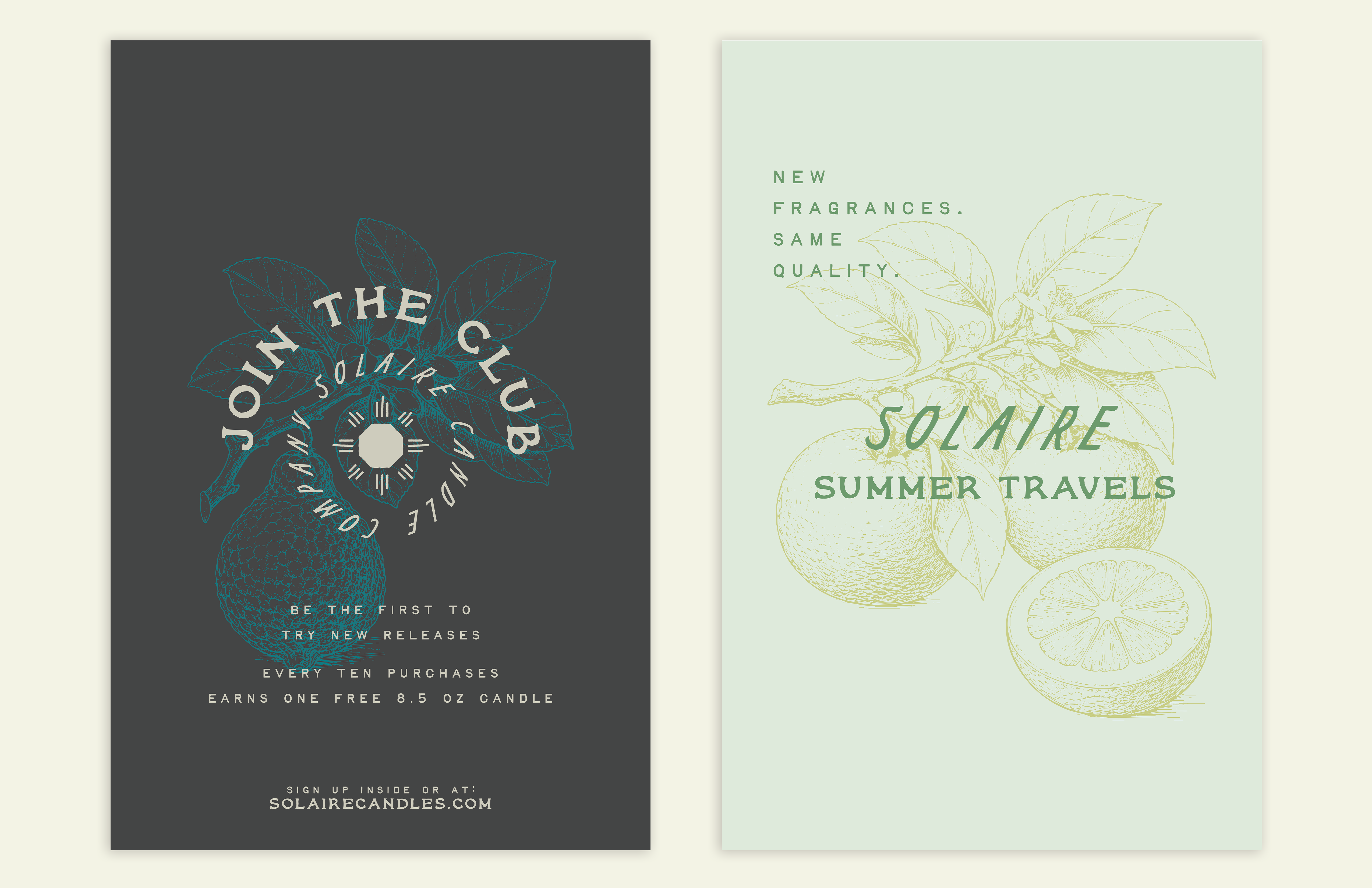
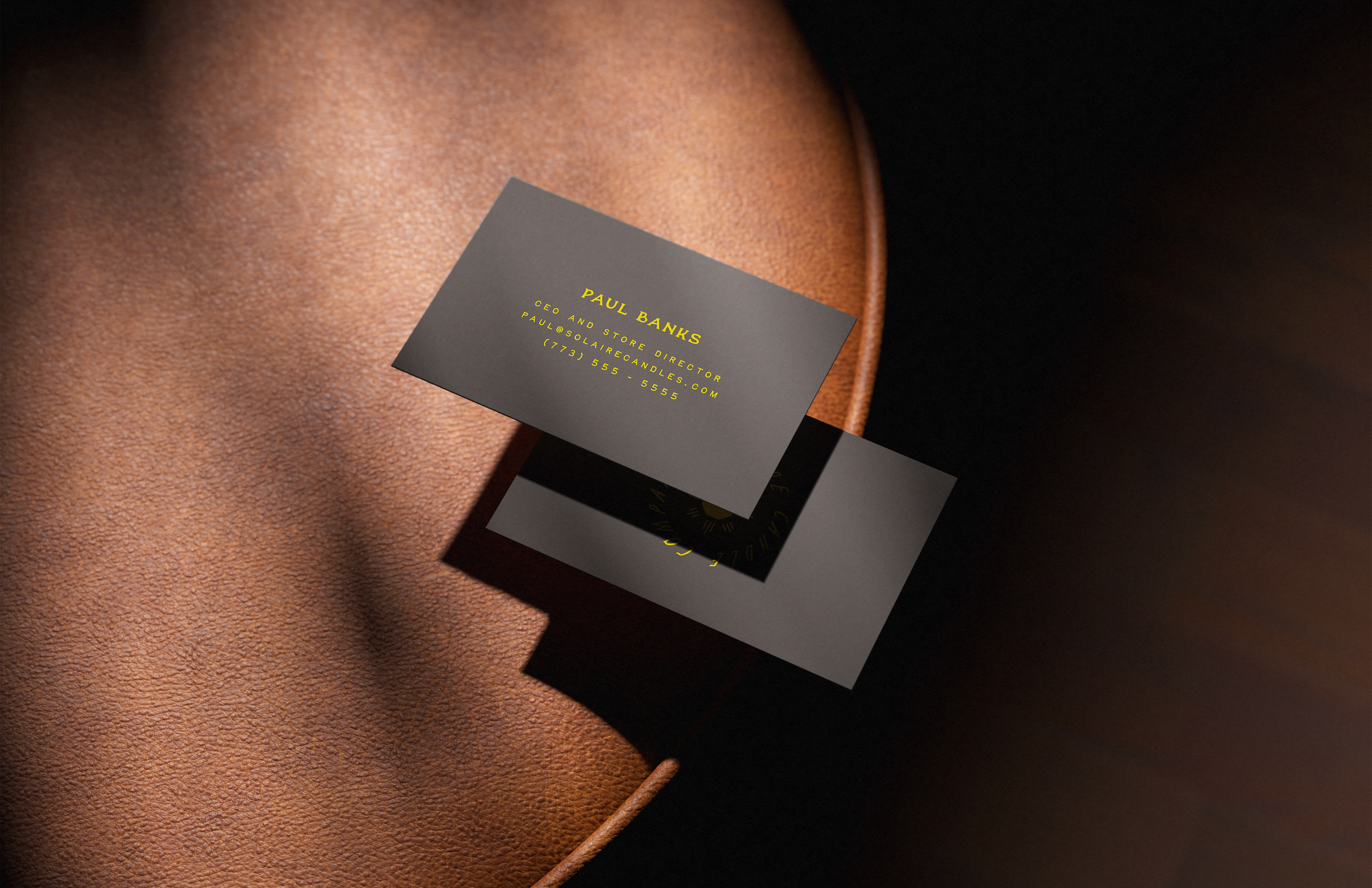
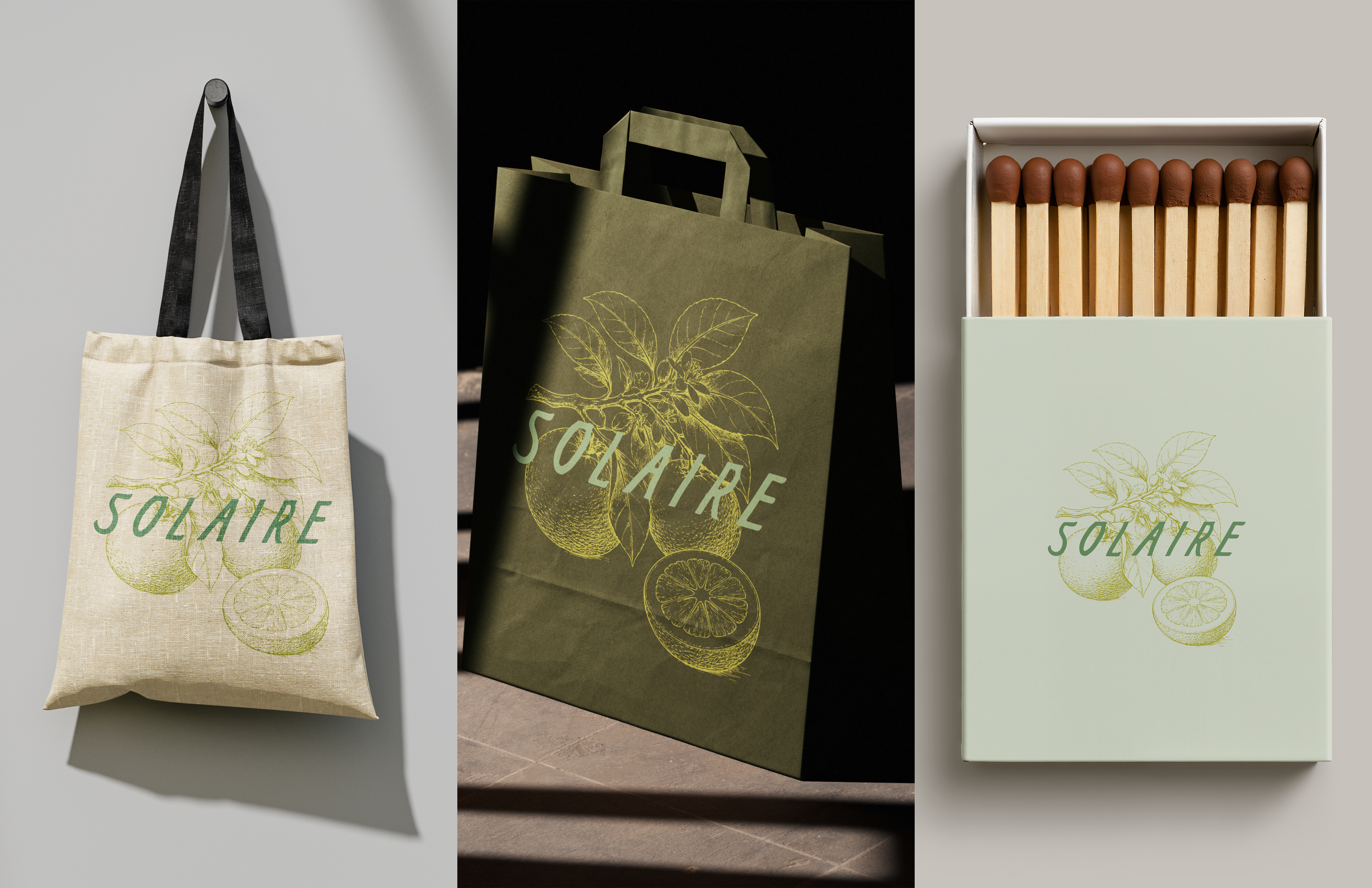
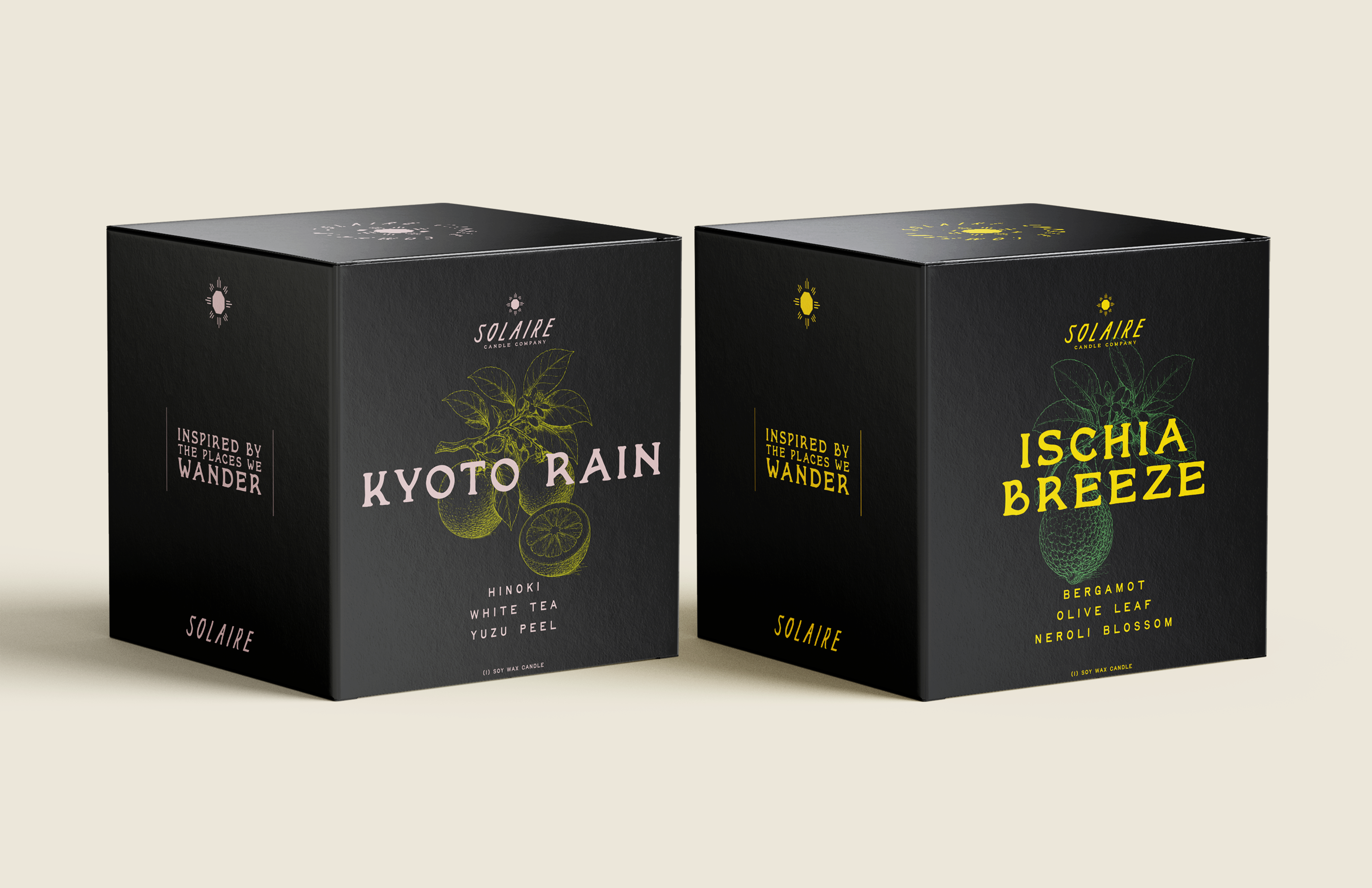
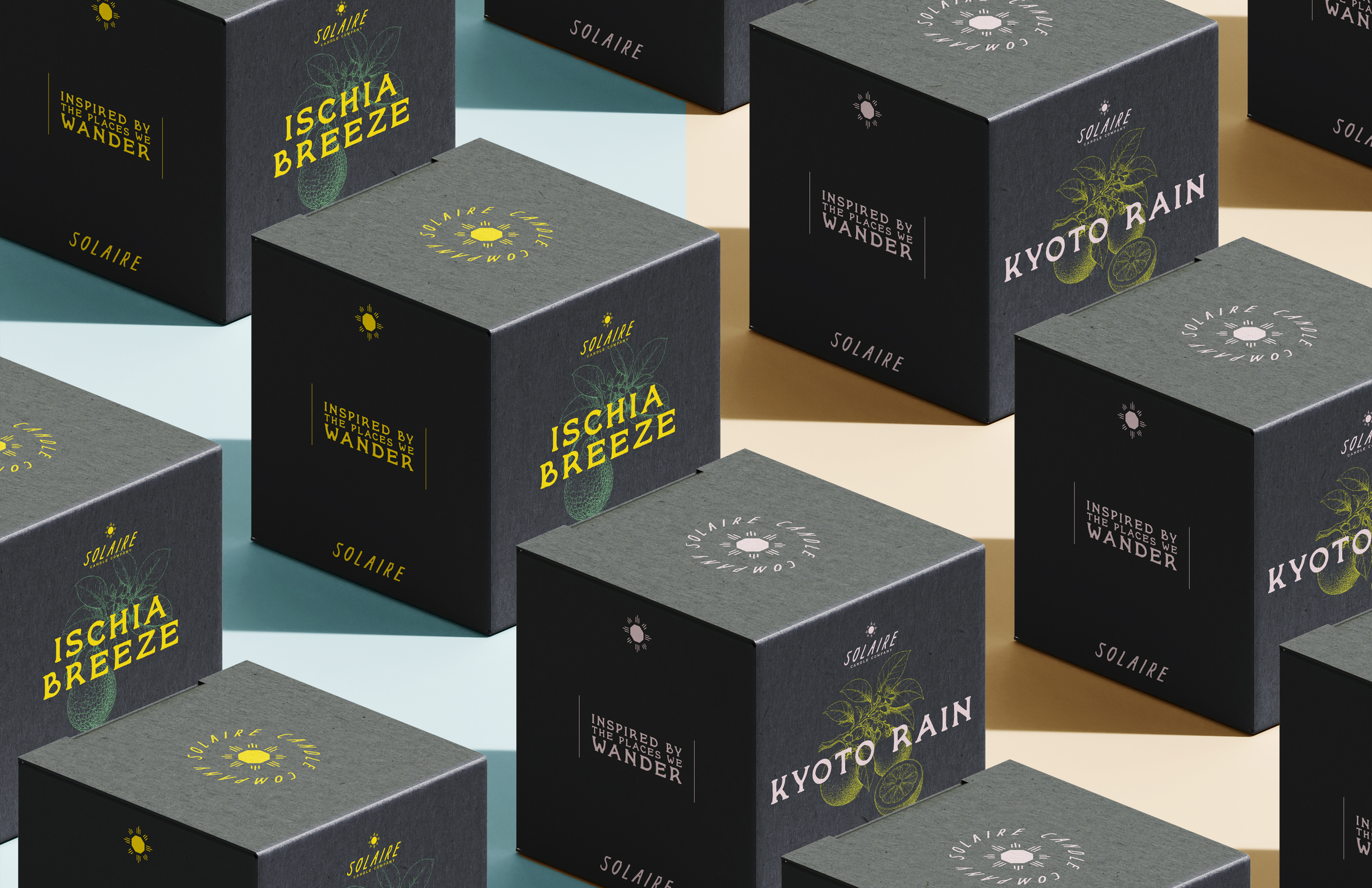
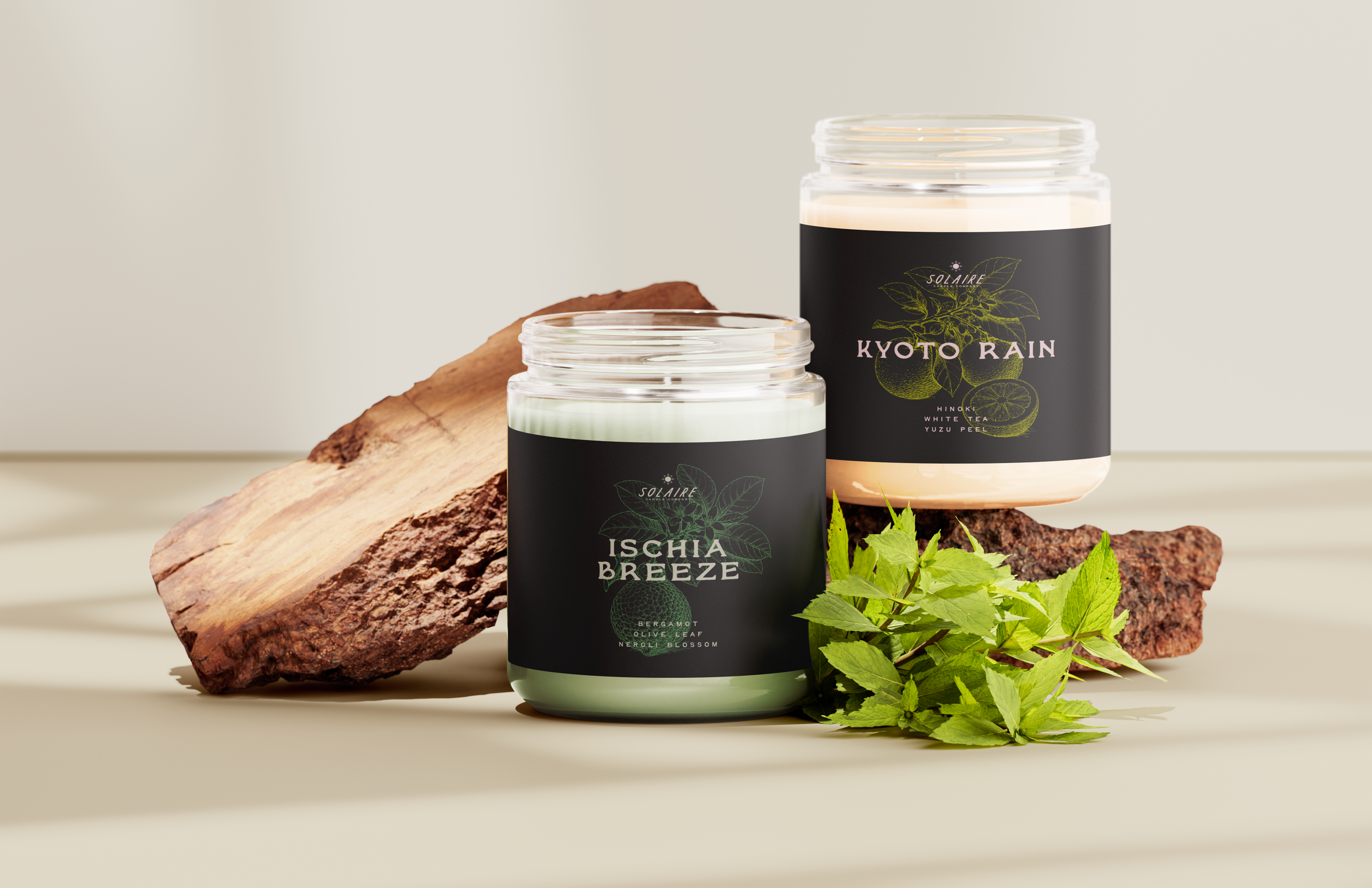
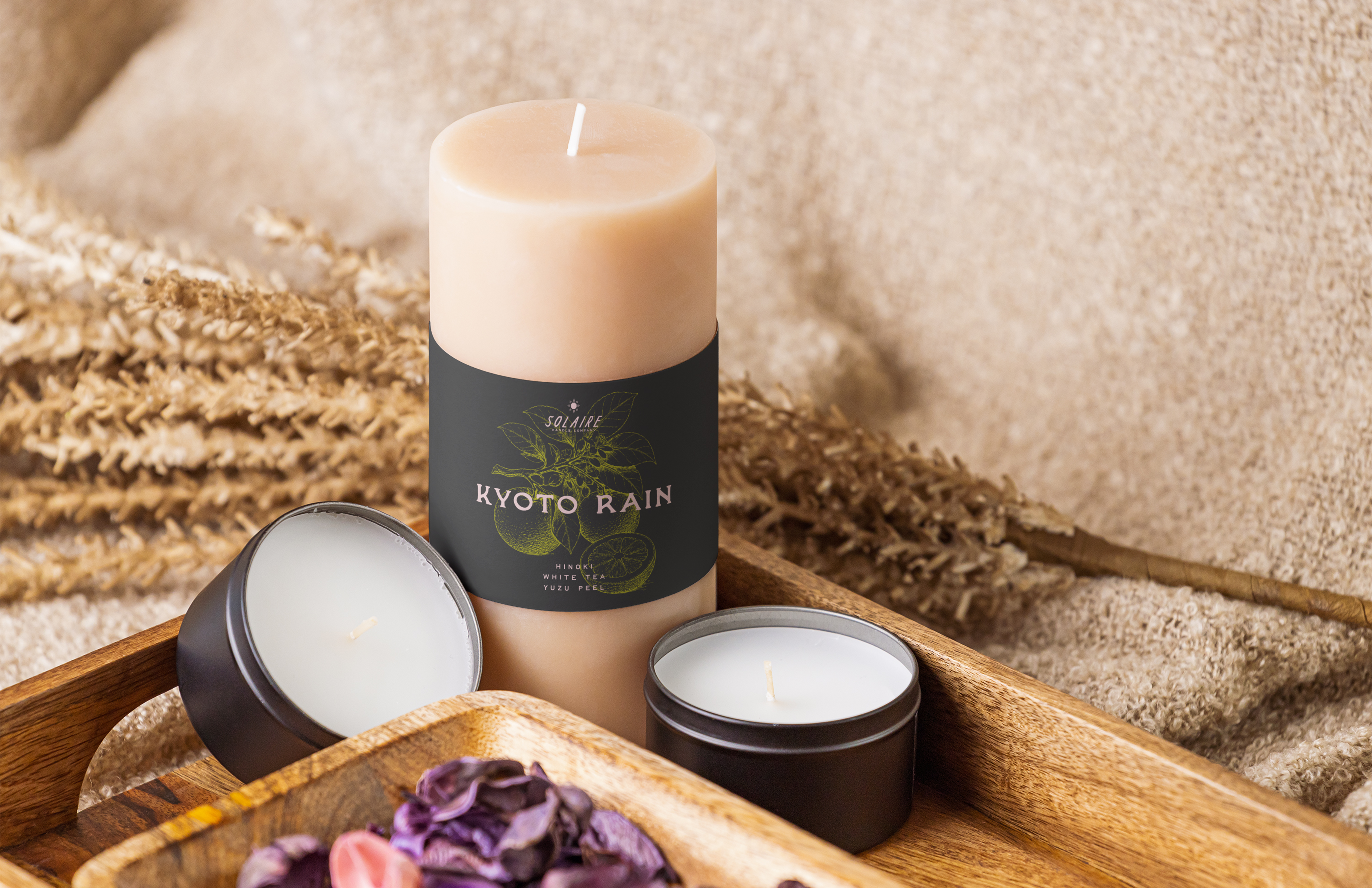
The charcoal coloring within the Solaire color palette grounds the brand and highlights the type which utilizes vibrant accent colors. This provides a cohesive shelf presence while still separating each individual product.